Research into other band's websites
As the second part of the NEA task is to create a website for the new artist, I have done research into other bands that create similar music to my artist and how they have presented their information. A website is important to reiterate the band's identity and promote their music.


https://www.amber-run.com
Amber Run
Genre: Indie Pop, Indie Rock, Alternative Rock, Rock
The Amber Run website uses a plain dark colour for their background, similar to what I've done as I've used a dark grey. They choose to advertise their new EP on their home page which is not something I have done due to the brief, however I have advertised the new single which is similar to what Amber Run have done but more subtle. In their 'Video' tab they have advertised a new music video which is similar to my 'Music' tab which promotes the new single and music video.


Panic At The Disco
Genre: Pop Punk, Alternative Rock, Pop Rock, Pop Music
On their homepage they have chosen one large image, this is similar to my choice where I have placed a large image across the middle of the homepage. They only have one picture which is something I can not do due to the brief however does support my choice to place a large picture on the homepage. The set up of their 'Tour' page is also very similar to mine. We both places a large image at the top of a concert and placed tour dates underneath with a link to buy tickets. We also both used a dark colour for the background creating a simple look making the website clear and uncluttered.


Friday Pilots Club
Genre: Rock
This is a website that has been done slightly differently to how I've designed mine. This band has chosen not to use a large image on the home page but a animation promoting their new single. Although this is different many elements of their website are similar to mine. For example, they have social media links on the homepage which I have also done. We have also both used a dark and light colour creating a simple contrast that will not clutter the website but create a clean affect. Thirdly, we have placed our tour dates in a similar way, showing the date, location and where to buy tickets.


The 1975
Genre: Indie Pop, Indie Rock, Electropop, Synth-pop
Genre: Indie Pop, Indie Rock, Electropop, Synth-pop
The 1975 has gone for a similar colour scheme to Friday Pilots Club and has used only flat colours of black and white. This may be to advertise their new album which has a black and white album cover. This simple colour scheme keeps the website looking clean and makes it easier to use. Once again their layout for the tour is similar to mine with similar features.


Bastille
Genre: Indie Rock, Indie Pop, Synth-Pop
Bastille has gone for a slightly different look to some of the other websites I have researched. Their pages are less simple and have more effects and colours. Personally, I prefer a simpler clean look as I find it easier to navigate the website. Their links to social media, tour, store and music are similar to mine as well as other websites and their layout for their tour is also similar. Their choice of background is to promote their new single however had you not been a Bastille fan you might not have known this as it is not particularly clear. The use of the colour yellow has connotations of joy and cheerfulness, linking to the title of their single 'Happier'. This might evoke joy from the audience when they open the website.


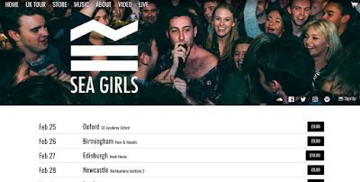
Sea Girls
Genre: Alternative/ Indie
The Sea Girls website has a video behind their logo on their front page, something that is not uncommon but not something I've seen since beginning this research. To advertise a new music video this may be helpful however may take away from the excitement of watching the video if fans watch it unexpectedly on the home page. Once again, the tour page and other links are similar to how I have laid out my page. The image on the tour page also looks similar to how I have structured mine, the use of a picture is used to create excitement for the idea of live music and a concert.


Anarbor
Genre: Pop Punk, Pop Rock, Alternative Rock
Once again, Anarbor has gone for a clean look with the pale simple colour block background. They have also chosen a large image for their home page which is similar to many other websites and their tour dates are laid out similarly too. Their choice for font colour however is too light making it hard to even read the tour dates, this made me think about the colours I am choosing and how practicality needs to come before appearance.
Comments
Post a Comment